Wine Label Packaging
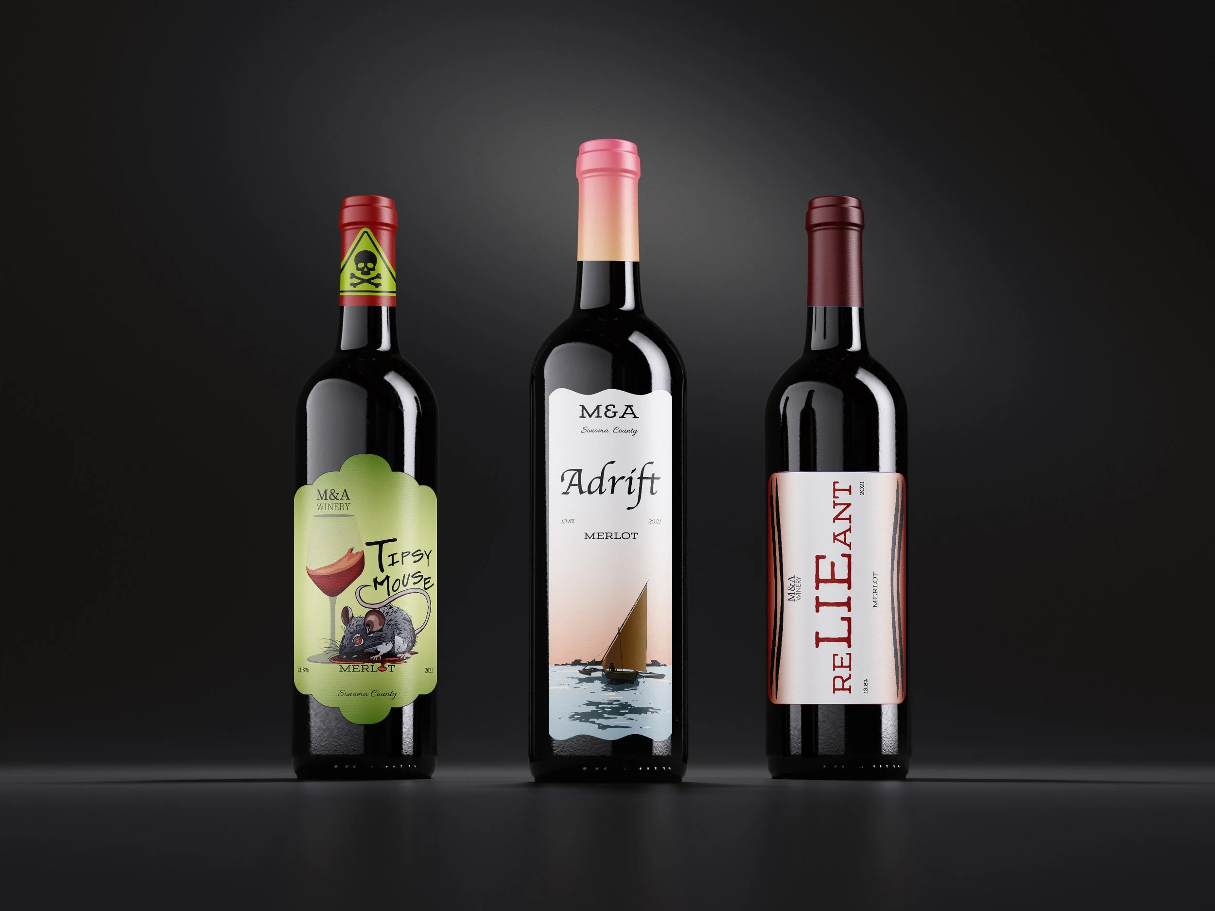
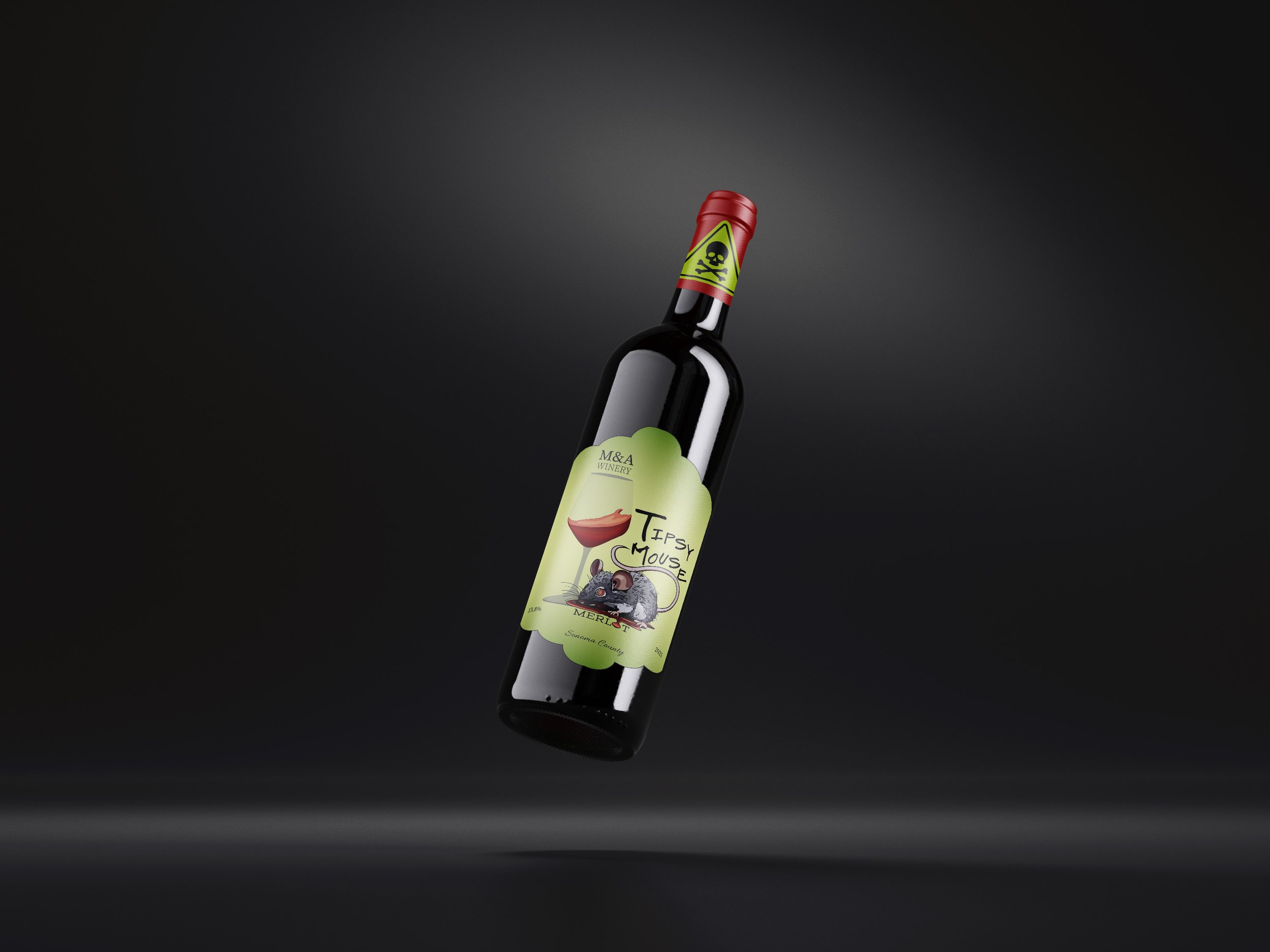
While creating wine labels, designers usually opt for three main styles: Traditional, Contemporary, and Casual. Traditional labels have a simple yet elegant design, focusing on the font style. For instance, Adrift’s label features a man drifting away on a boat into the sunset underneath the emphasized title in a more elegant typeface. The contemporary styles are more modern and typographic. In the case of Reliant, the word has been intentionally misspelled to emphasize the word “LIE.” Casual labels have a more relaxed and sometimes comical approach. The idea behind Tipsy Mouse stemmed from the rats found in Chicago. Understanding the different styles of wine label design is crucial in communicating the essence of the wine through the packaging. Each style has its unique charm that can influence the consumer’s decision to purchase the wine.


Next Groove
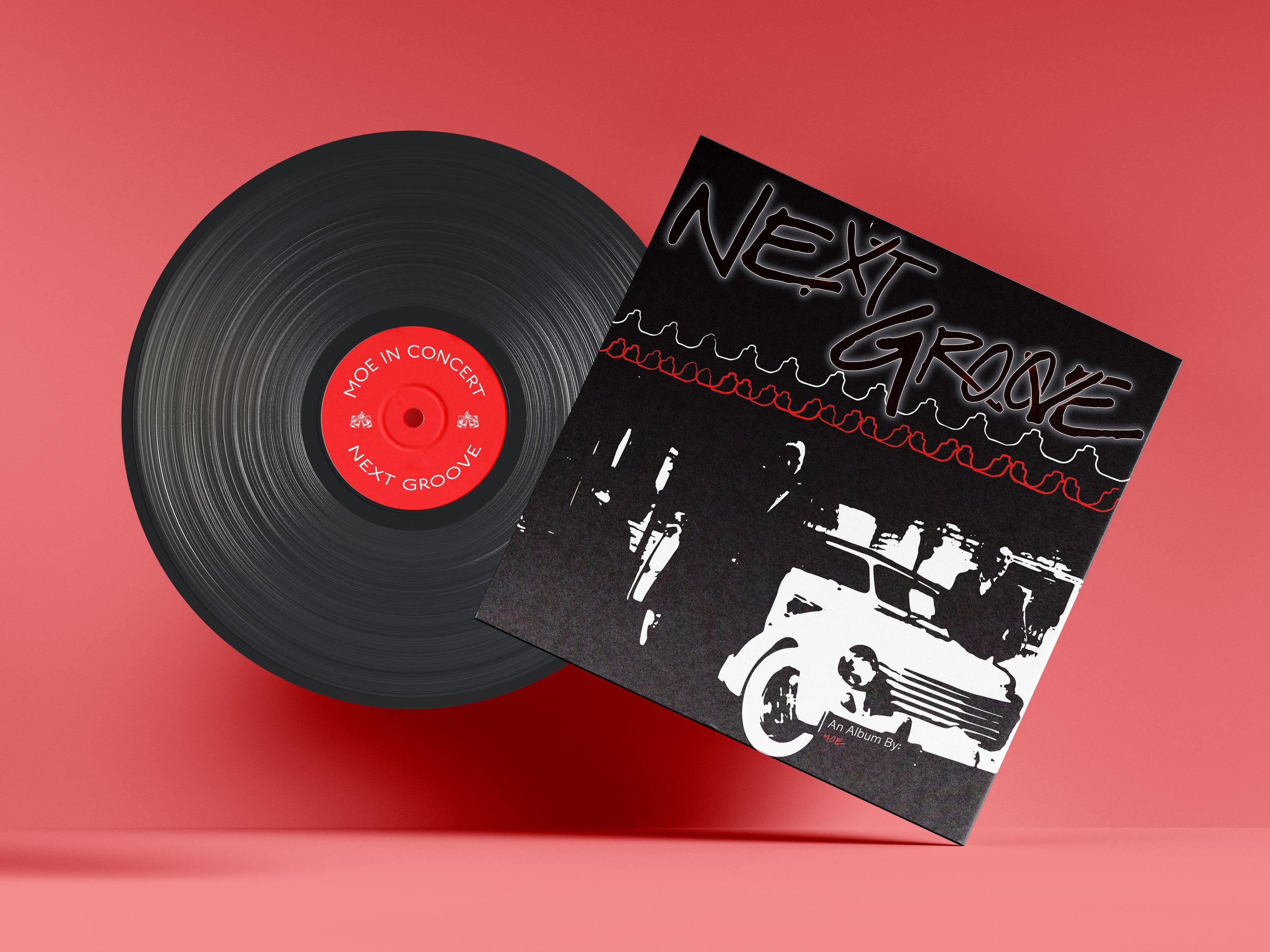
The Next Groove Vinyl project combines jazz and pop (Tuxedo Junction) with folk music (Ken Lyon in Concert) in a cohesive design. Inspired by Tuxedo Junction’s imagery, black-and-white silhouettes and a custom typeface were created. The design seamlessly blends the two genres, with the silhouette symbolizing their fusion and the typeface enhancing the dynamic movement. This approach offers a compelling narrative that captures the essence of both musical styles within the vinyl’s visual presentation.


Robin’s Nest
A dream to become a reality. Robin’s Nest is a coffee shop with the essence of Italian culture. Coffee originated in Venice, Italy. I wanted to implement the design and the products sold, bringing Italy to the city of Chicago
![Passion Project_Robins Nest_coffee [Recovered].jpg](https://images.squarespace-cdn.com/content/v1/607df399e00788661f9dd3f1/829221c3-4a93-4319-bab2-8635dadb06c2/Passion+Project_Robins+Nest_coffee+%5BRecovered%5D.jpg)
Sunbelt Bakery
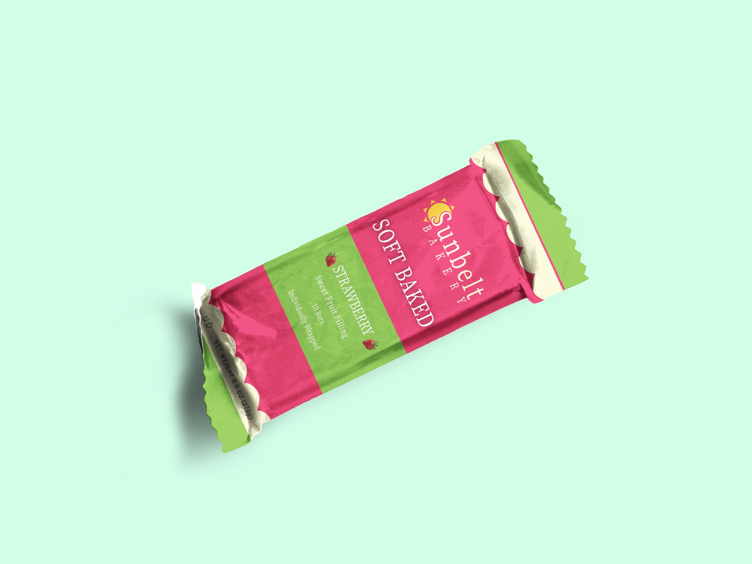
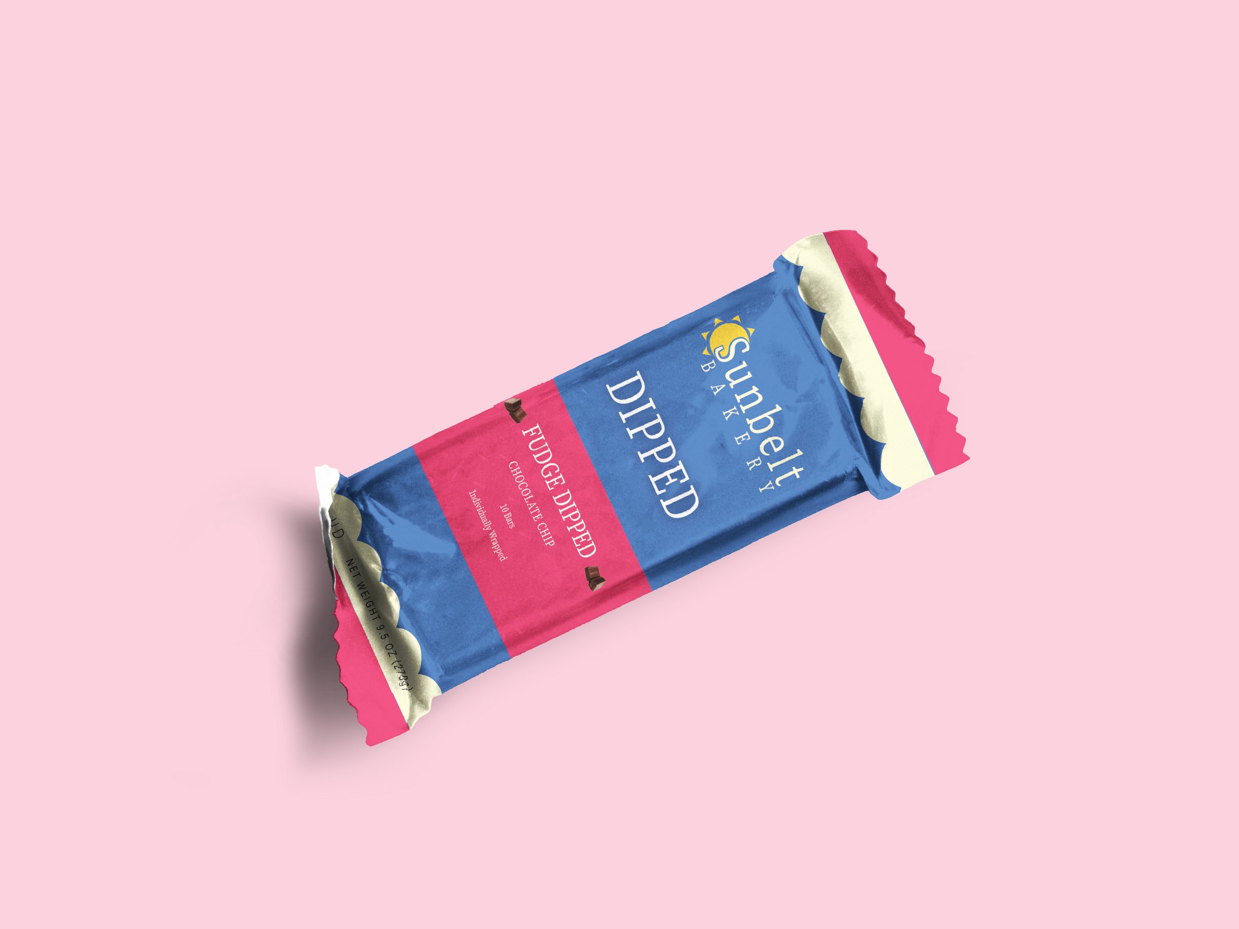
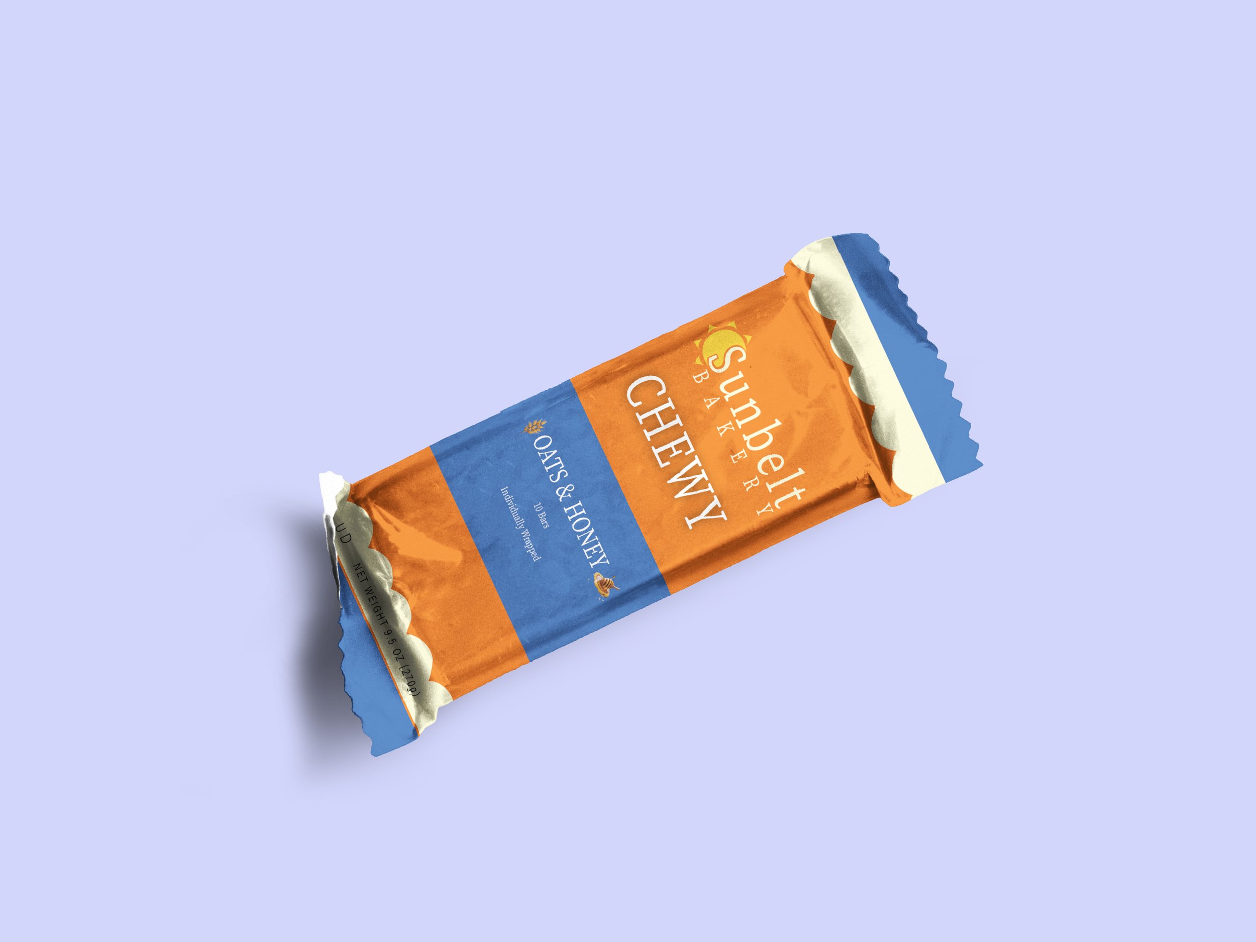
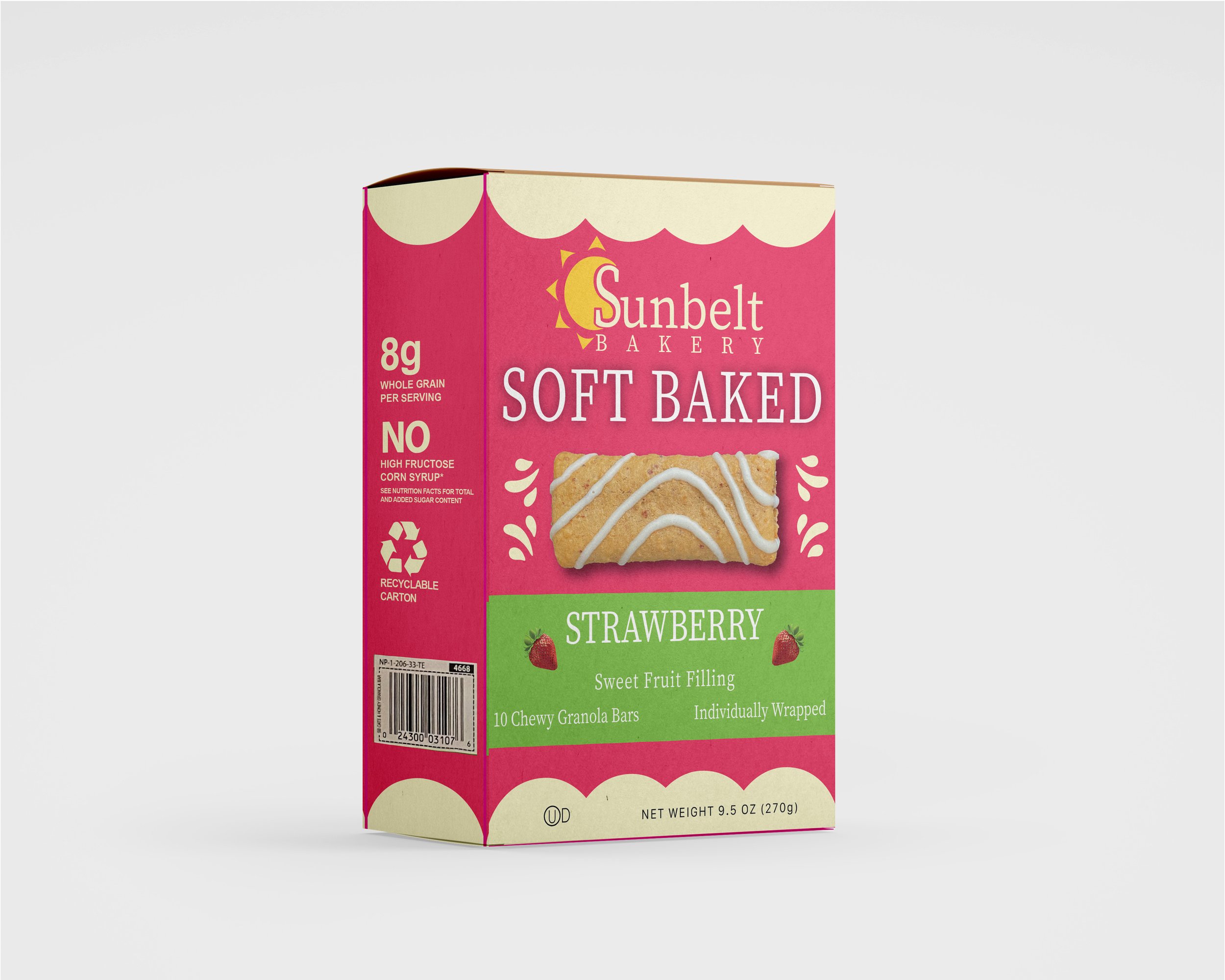
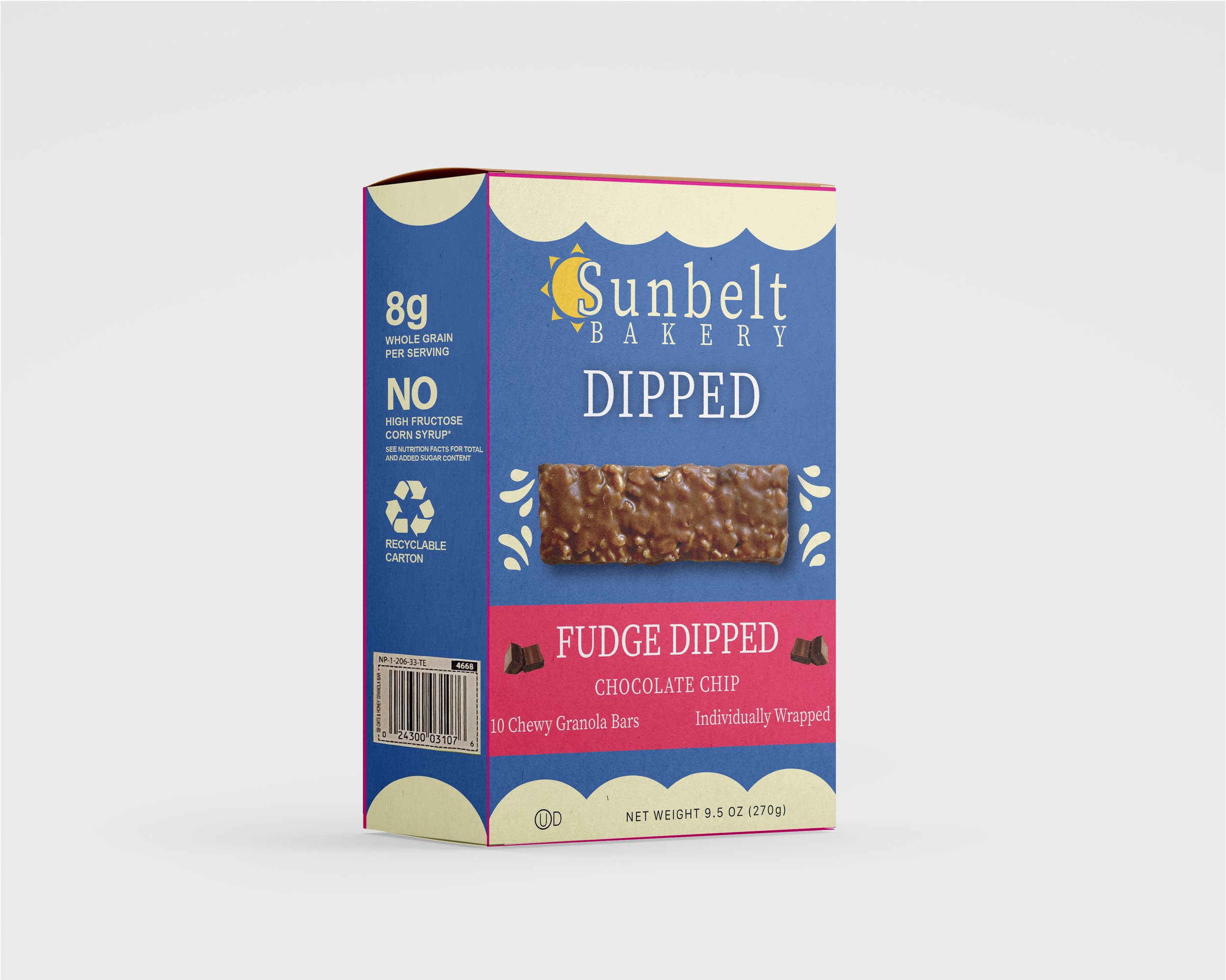
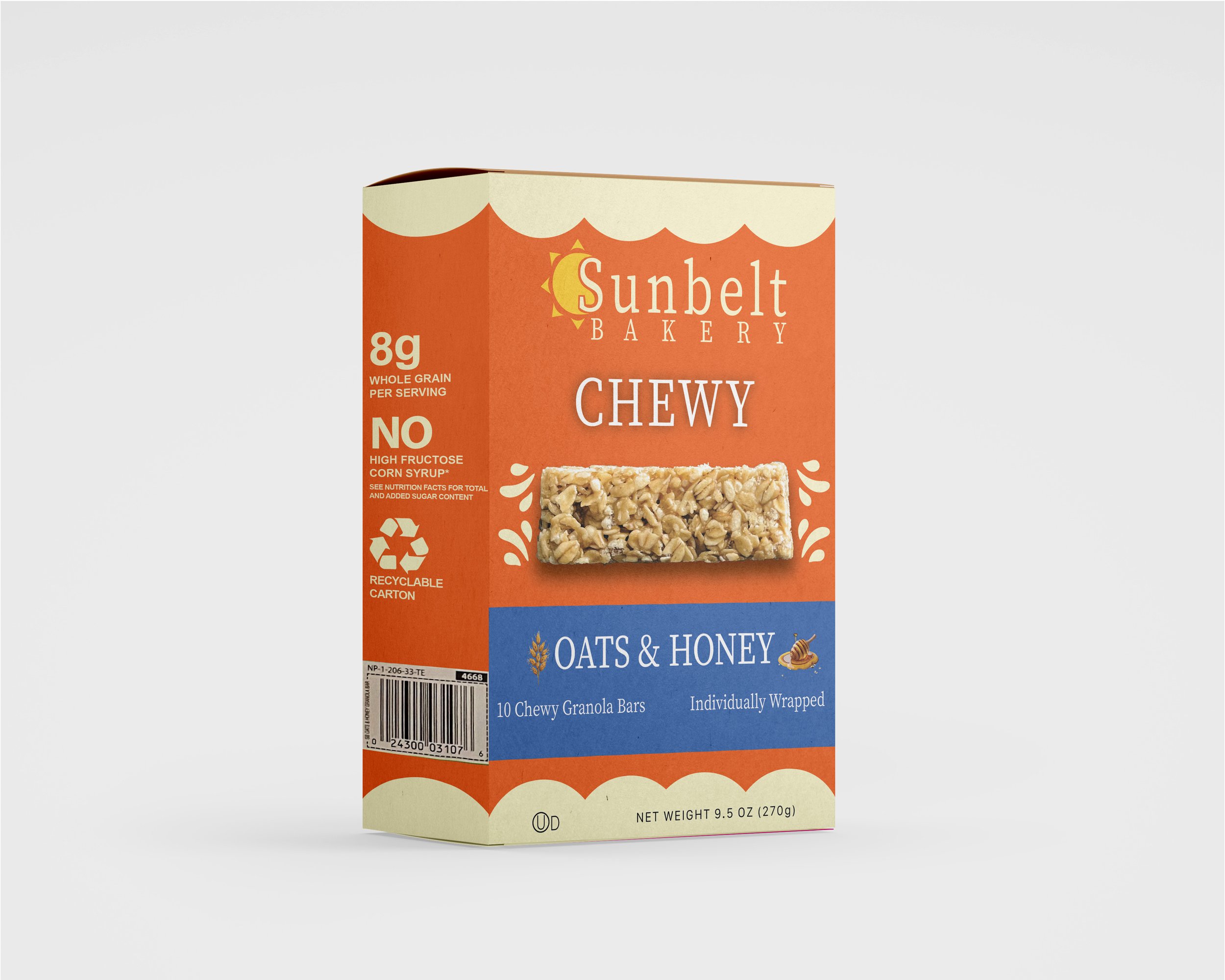
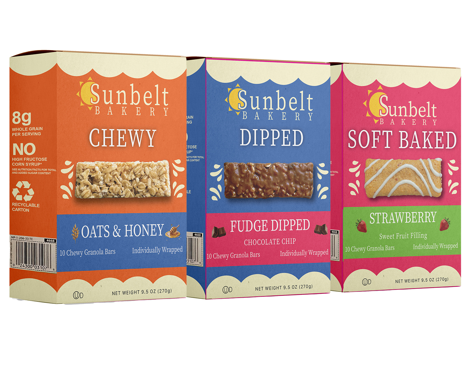
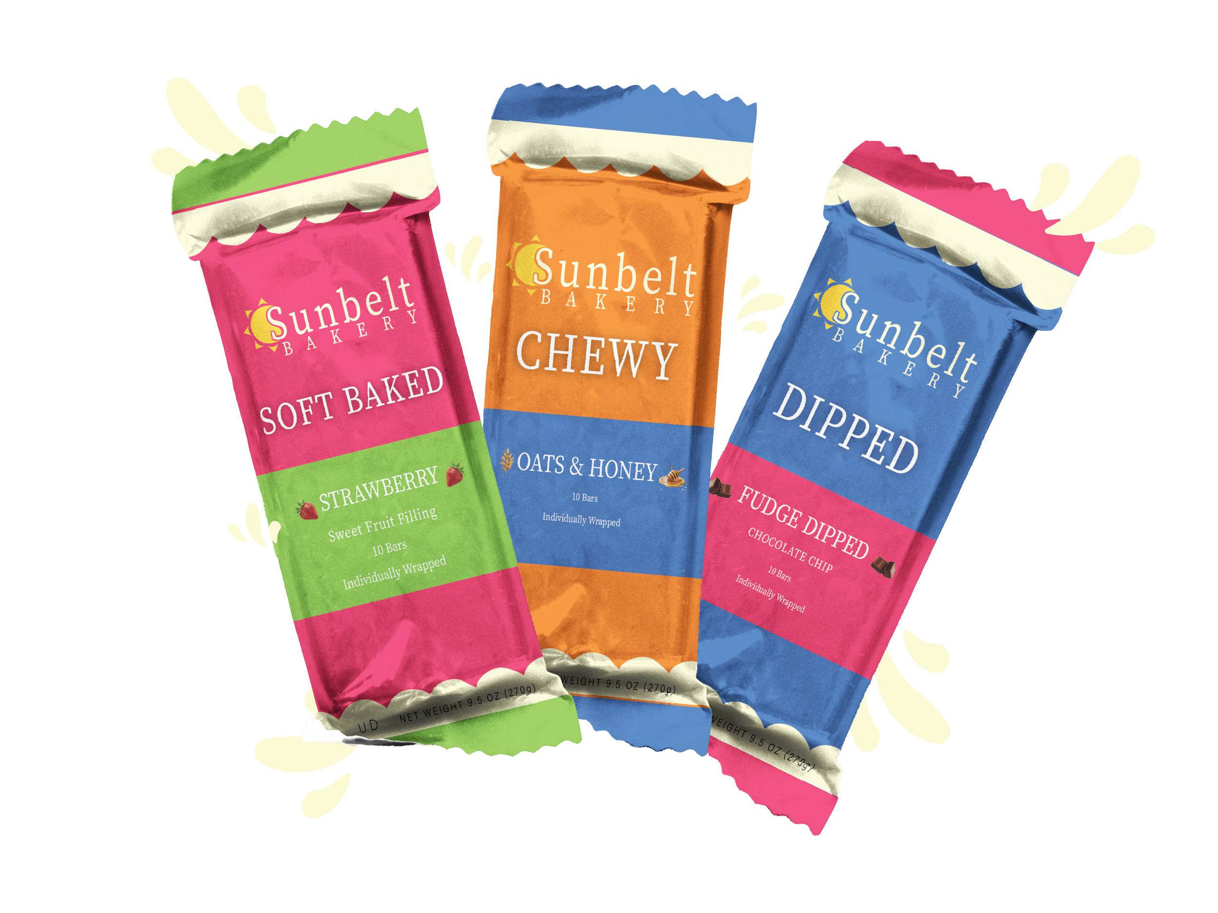
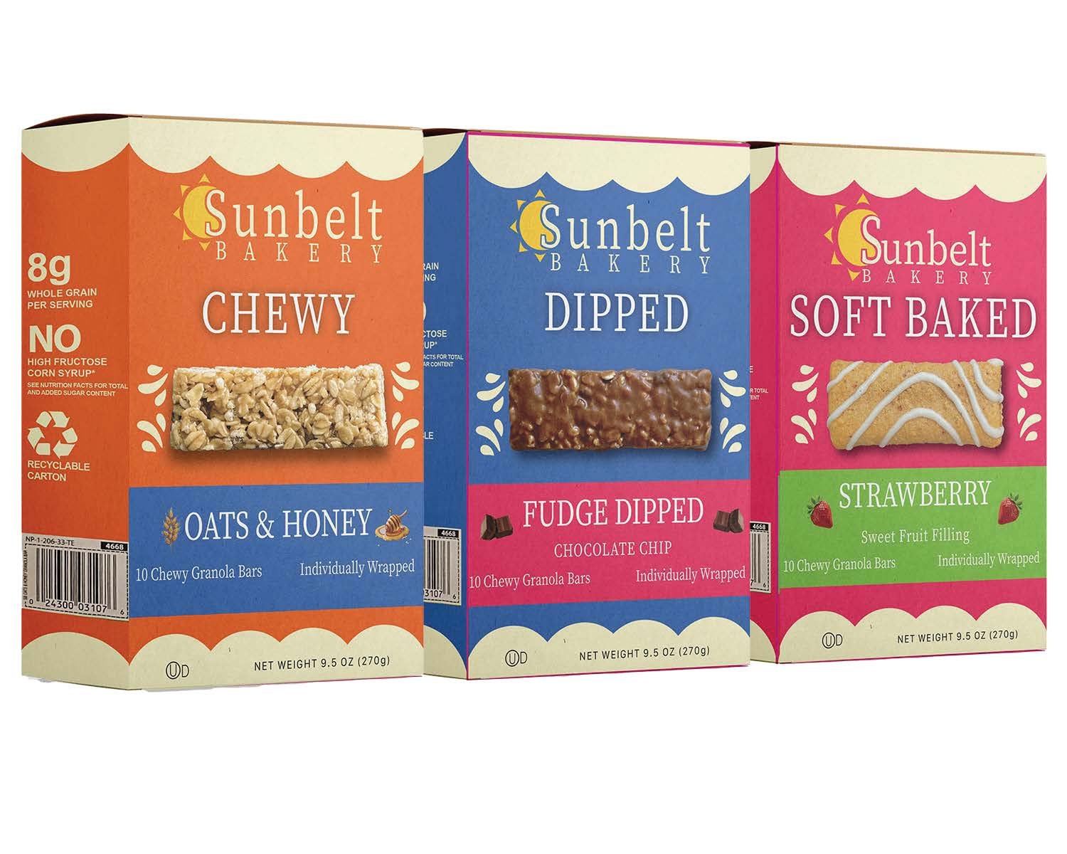
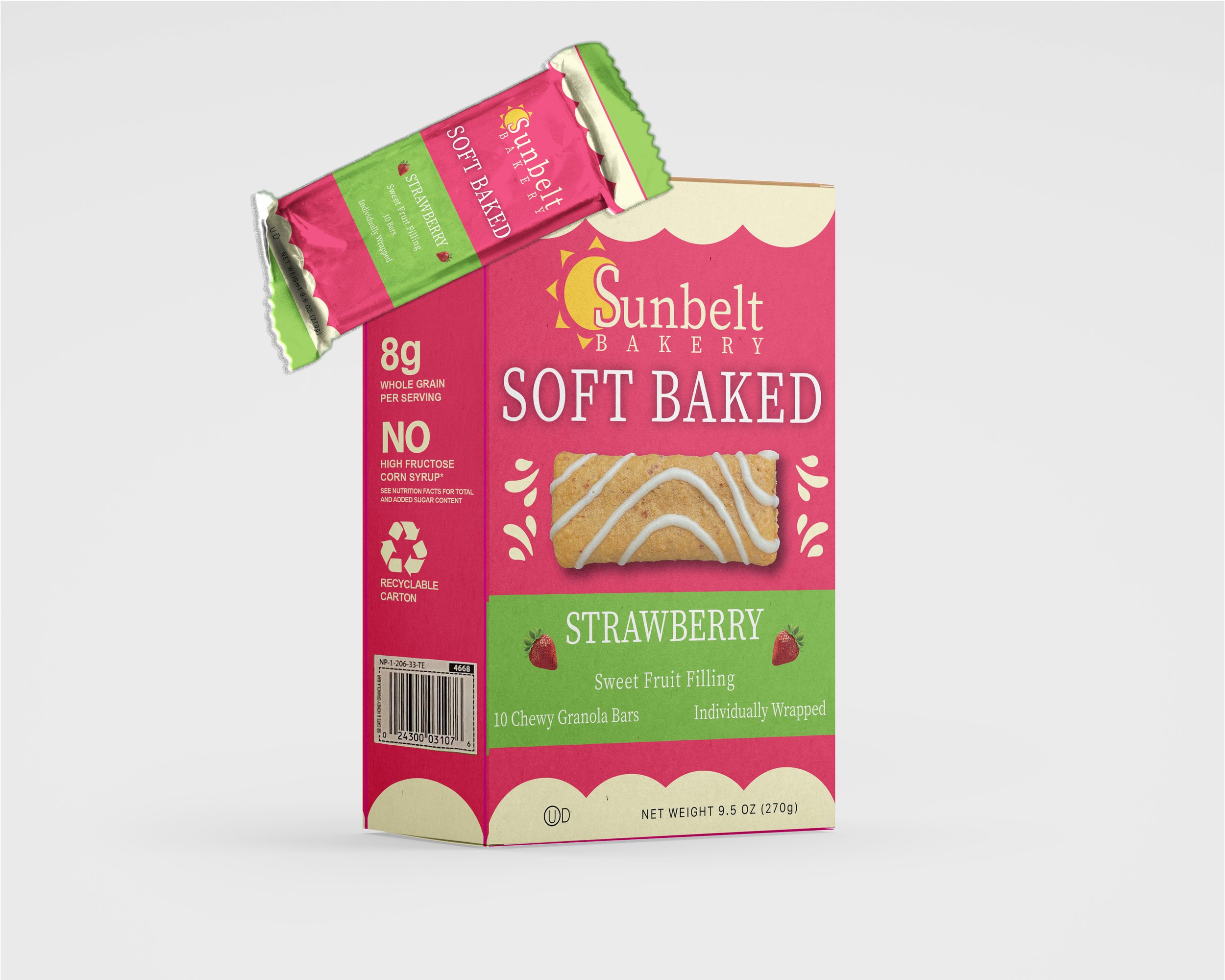
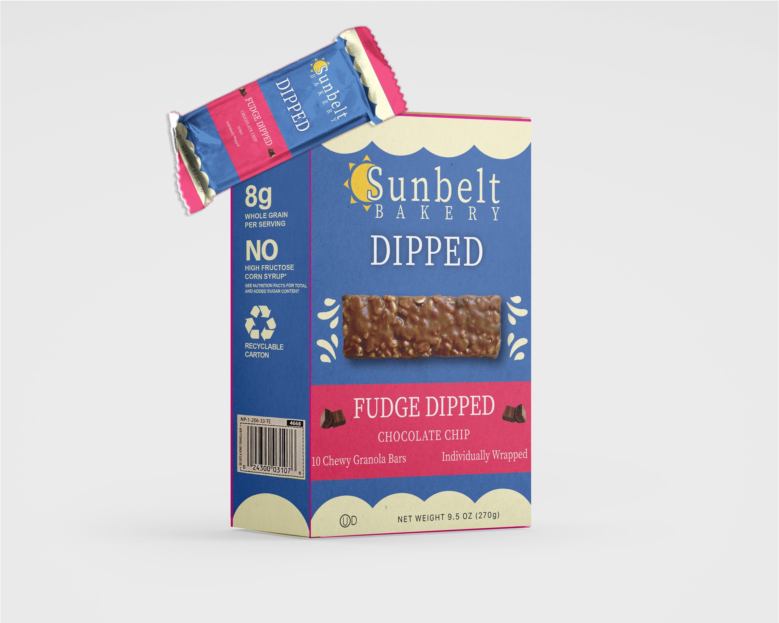
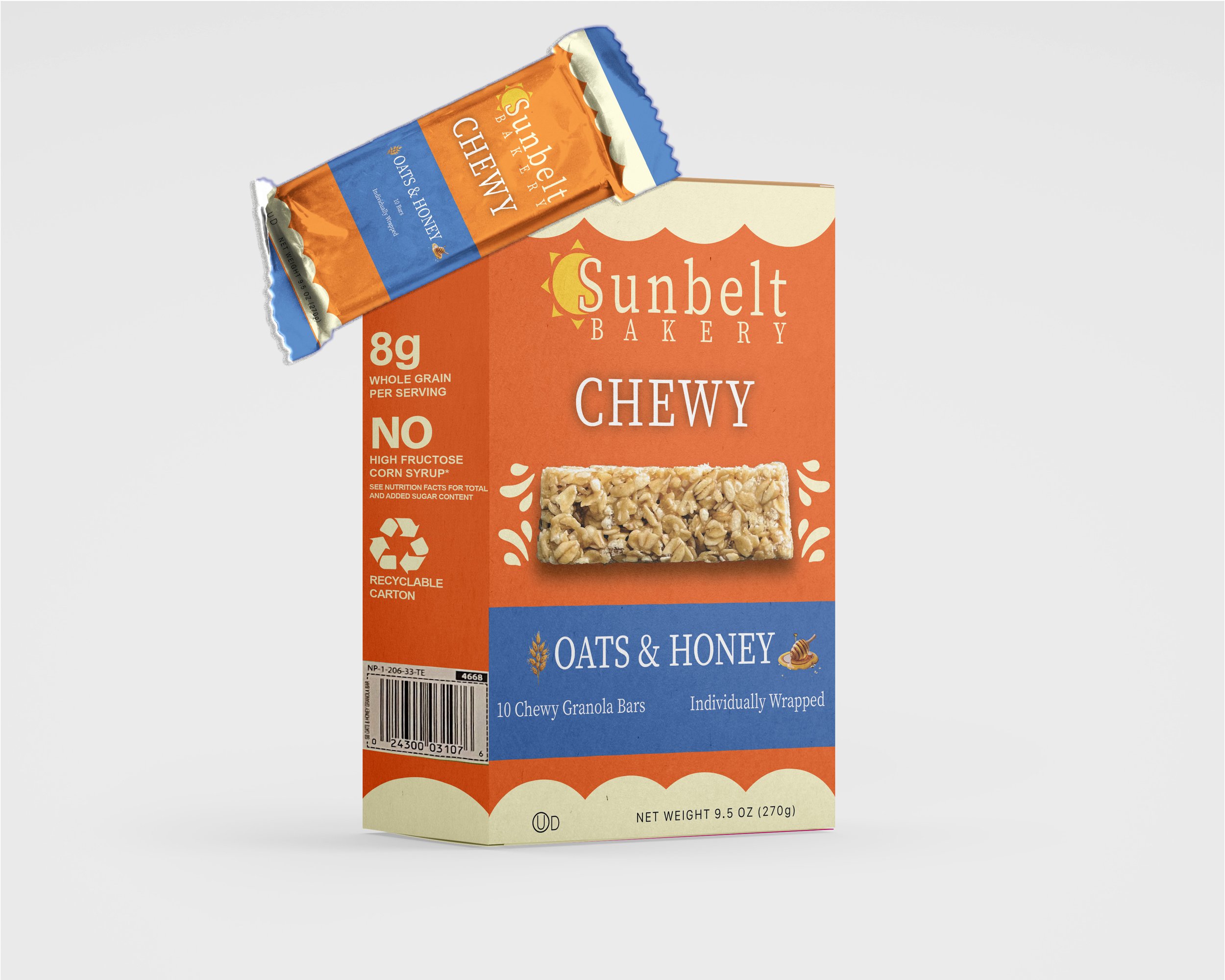
This project aimed to revamp the logo and packaging, creating a more striking and streamlined design. The original concept incorporated typography alongside a wheat symbol in the background. The new logo adopts a simpler approach, with a small mark accompanying the logotype. For the packaging, I opted for three distinct flavors: Fudge Dipped, Oats and Honey, and Soft Baked. This included both the box and bar wrappers for the product. The aim was to enhance the design and typography hierarchy while also reflecting some of the brand’s core values. The logo and packaging rebrand project aimed to refresh the brand identity while retaining some original elements. The updated design presents an opportunity to appeal to a broader audience.
